Introducing the Korea Productivity Center’s CI.

Crafted with clarity and strength, it elevates communication and embodies KPC’s position as a premier knowledge services organization.

Corporate Identity

Logo

Watermark
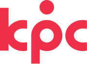
The KPC CI symbolizes a virtuous cycle of growth within the corporate ecosystem, powered by productivity. It represents the dynamic flow and integration of KPC’s core values.

The circle above the “p” denotes productivity, while the inner circle reflects continued growth and expansion.
The “k” and “c” embody KPC’s commitment to trust, shaped through openness to customer voices, and its direction toward delivering premier knowledge services driven by innovation and insight.


Signature

Horizontal combination
Korean

Download PNG file

Horizontal combination
Korean and English

Download PNG file

Vertical combination
Korean

Download PNG file

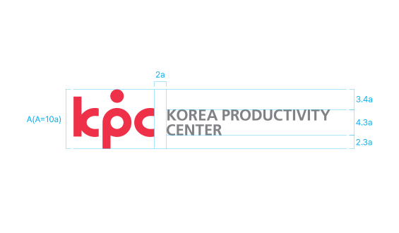
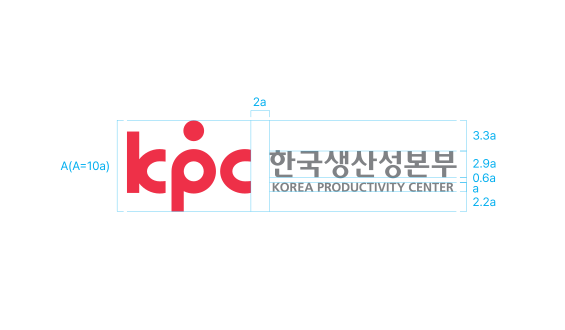
Grid

Korean

Korean and English

Color

The primary color, red, represents the passion and commitment of KPC as a leading productivity institution and premier knowledge service organization.

RED

R238  G48  B72

C0  M95  Y70  K0

#EE3048

SALMON

R243  G119  B111

C0  M67  Y50  K0

#F3776F

GRAY

R2128  G130  B133

C0  M0  Y70  K60

#808285

WHITE

R255  G255  B255

C0  M0  Y0  0

#FFFFFF